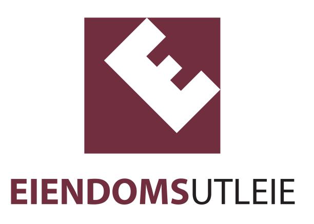
Logo redesign
EiendomsUtleie (PropertyRentals in English), is a small property firm specializing in renting out office and commercial properties in Stavanger and Sandnes in Norway. Initially the owner approached the company I currently work for to have a banner created, but I came up with the idea of creating a new symbol in the logo. Previously the logo had consisted of only the font, but I created the square with an 'E' in it (the first letter in the company name). If you look closely, you can see that the negative space created by the 'E' up in the right corner, creates a house symbol. The customer loved it and they have put the new logo on posters, banners, cars and car trailers I also designed for him.
